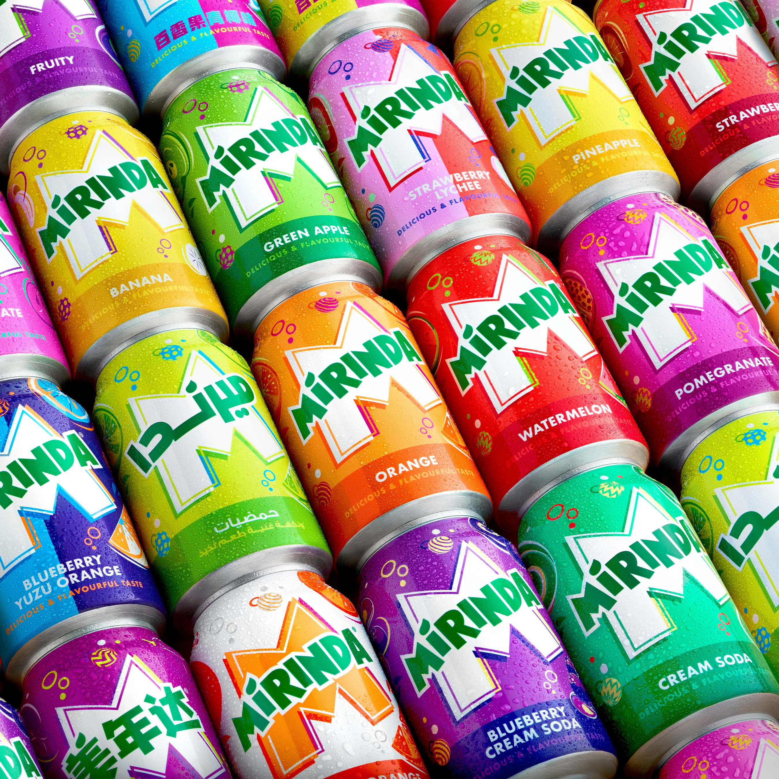
MIRINDA REBRANDING ILLUSTRATIONS
Client
PepsiCo
Year
2024
Graphic Design
BUCK
Illustration
Estudio Santa Rita
Animation
BUCK
The Mirinda® team reached out to us to collaborate on the rebranding of their brand, aiming to align it with their new product, logo, and ambiance. Our task was to create representative illustrations of the various flavors of their beverages, seamlessly integrating them into the overall design. To achieve this, we developed a comprehensive illustration system to encompass their wide range of products, along with a set of spheres as a graphic resource adaptable to their needs.
In line with the new visual version of the "M" in the logo, where they intensified the green tone and refined its lines, we created a unique system for each of the 50 flavors across their product range. Utilizing illustrations of the characteristic fruits for each flavor, we developed exclusive color palettes to clearly distinguish each variety. We opted for vibrant and contrasting colors to enhance a dynamic and appealing image. These fruit illustrations were accompanied by bubbles with textures evoking the flavors of the beverages, adding a distinctive visual element.
BUCK implemented our illustration approach into the design system by creating the detailed brand guideline and asset library to ensure consistency in all visual aspects of the brand, in line with the pack guidelines authored by the PepsiCo team. Moreover, they produced animations that brought our fruit and bubble illustrations from the 2D plane into the thrilling three-dimensional realm.
This project focused on revitalizing the brand, with particular attention to its positioning within the Gen Z market, through a fresh, vibrant, and carefully considered design.


All material included in this website belongs to Estudio Santa Rita©. It can not be copied, used, or modified unless it is stated in a specific contract between the two parts. Estudio Santa Rita©2024 Copyright.
